Friday, January 4, 2019

testing

“THE LADY WHO USED TO FEED HIM HAS MOVED AWAY and Other Incredibly Sad Dog Cartoons, compiled and with an essay by Bruce Simon” is my personal nomination for a coveted 2018 Pick-Of-The-Litter(ature) Award.

Though self-published, this is a very rare book. A wide variety of readers may approach the content for distinctly different reasons. While the book appeals to me as a cartoonist, animal lovers will find much to savor, too. Though oblivious to the charms of cross hatching, they will ponder the plight of dogs living in a world run by hairless apes. Child readers will be intrigued by more than the doggie stuff, and rich details of a bygone era will certainly broaden their horizons. They may also notice that the children in these strips are often in alliance with animals against overbearing adults. And cultural aficionados justly deserve to have their snouts rubbed in the overt sentimentality--ranging from bathos to pathos--that drips from these enchanting pages, in order to remind them of the power of great cartooning.

The book also provides ample evidence of the changing social standards towards animal cruelty. A couple of cartoons feature boys entrusted with the task of killing unwanted litters of puppies and kittens. These days if a kid was caught red-handed throwing a potato sack of live kittens (plus rocks) into a creek he would doubtless be the grist for local evening news and would wind up in a psychiatrist’s office. Back in the era when these cartoons were done, such a heinous act would be seen merely as an unpleasant household chore to be done, lest a severe spanking be endured (which would also make today’s evening news and warrant psychological intervention).
 
 The subtle emotional range dogs constantly exhibit in demeanor and posture are shown with the deft simplicity of masterful pen work by several great craftsmen of the early 20th century. As an added bonus there is a brief bio of each:
CLARE BRIGGS
H. T. WEBSTER
J. R. WILLIAMS
ED DODD
FRANK BECK
STANLEY LINK
The stunning back cover is done by FRANCES "EDWINA" DUMM

  The images tend to be deceptively simple, but facial expressions and postures replicate life in a way that photographs rarely do. These are done with rapid line work that not only respects each animal; newspaper deadlines also had to be respected. This exquisite gallery of cartoons is a testimony to artistic grace under pressure. It's hard to believe that newspapers were once almost twice the size of what they are now. This scale permitted fine detail work and substantive text that readers came to expect for the few pennies they paid. When television replaced print as the main source of news, shrinking advertising income led to cost-cutting measures such as reduced page count and smaller page dimensions. The pared down cartoon format could no longer handle rich detail work so a minimal style driven by writing, not art, came to rule the day. The success of the main theme in most of these drawings--the plight of the dog in the world of man--is dependent on the generous scale of the background. There is great artistry involved in creating backgrounds that dramatize without dominating the human and canine subjects. Other than Bill Griffith's "Zippy" I can't think of any regular feature today that is staged with such lush tonal patterns, deep perspective space with full figures on a ground plane--crafted with traditional dip pens.

In his introductory pages, Bruce explains the genesis of the project and his motivation for seeing it thorough. He also looks back at a lifetime of scissoring cartoons from newspapers and archiving them in scrapbooks. These will eventually be sent to the world famous Billy Ireland Cartoon Museum at Ohio State University. His appreciation for the art form is met with equal fervor by his compassion for animals. His statement epitomizes both subjects:
     "These cartoonists, famous for their ability to observe and convey the everyday humor of domestic life, childhood and the human condition tried, with these bleak looks at helplessness that met with indifference and abandonment, to open the hearts of their readership to needs beyond their own, and that is something unique in my lifetime study of the form."

There is a delightful drawing by Carol Lay on the title page and Noah Van Sciver did a colorized version of an H T. Webster panel for the cover. HIs palette nicely conveys the somber subject matter from which the book's title is taken: A dejected pooch, a trusting creature of habit, lingers outside the gate of an empty house.

By purchasing a book for a mere $10, you are contributing that full amount to the Muttville Senior Dog Rescue in San Francisco. Bruce Simon will handle out-of-pocket the printing, shipping and handling. A Paypal can be sent to kinevideo@aol.com or you could contact him there and get his mailing address if you'd prefer to send a check. Muttville (founded in '07) has been recognized for its groundbreaking approach to animal rescue. It's cage-free facility, focusing on foster outreach, has an on-site veterinary suite and its hospice program are wonderful innovations that have been lauded and emulated around the country. Cartoonists: Please don't try to short the IRS by claiming this book as both charitable giving and then do some sneaky double-dipping by also listing it as a deduction for printed materials (to which you are annually entitled).

The technical quality of self-publishing is now on par with the highest standards of trade press production. There is something to be said for this direct relationship with the final book, especially in reducing waste, as each order is filled and mailed on a per unit basis. Of course, it's very time consuming and frustrating to hawk your own wares. But let's face it, very few of us are able to scratch a living from this arcane field. When you are motivated by love, such concerns are incidental. A steady one permeates every page of this little volume.

Wednesday, August 6, 2014

On Killing Your Toilet


In addition to a wrench and bucket, you'll also need about 3 minutes of attention span to read the following instructions. To "Kill Your Toilet" you must first do some simple yet invasive surgery on your kitchen sink. It may be that you'll have to borrow the kind of wide-mouth wrench needed for this little project. It's got to be big enough to fit around the fluted knob or large hexagonal nut that's keeping the U-shaped pipe under the sink in place. It's got to go...

Dishwater is the primary source of the greywater that you'll
constantly be carrying to your toilet (and you could also have an
auxiliary set-up with your bathroom sink). When that U-shaped
pipe is gone, the little straight segment of pipe that goes up to
the drain will empty directly into your bucket. I recommend a
2 gallon type with a pouring edge.

You'll want to seal off the pipe that was attached to the other
end of the U-joint. If you don't, there will be fumes from the
fetid drainwater now trapped there.

As for the toilet itself, all you have to do is turn off the little
handle which controls its water intake, usually located near the
baseboard. Your next flush will be your last. That's it! The toilet
is now "dead" because from this day forward you'll be pouring
your dish water into the reservoir tank behind it. Provided that
your drain water was strained prior to filling the bucket, your
toilet won't even know that it's a goner. Millions of gallons of
tap water could be conserved this way.

Let your co-workers, friends, roommates, spouse, children and
loved ones crow about how eccentric you are. They are just naive
fools who dispatch their bodily waste products into our rapidly
diminishing lifesource as if there were no tomorrow.

Saturday, May 11, 2013

Stained Glass Design

These designs were commissioned for the front door of a friend in Cincinnati in '05. Each pane represents a season and has the initial of one of the family members. I didn't do the actual fabrication.


Wednesday, January 16, 2013

My Drawing Table

This is a versatile drawing table/easel system that functions as an adjustable light table, too. The construction is very simple, yet it's sturdier than commercially available drawing tables. Though my primary medium is pen and ink, I also use it for water media and enamel painting.

A) My drawing surface of choice is thick plate glass. I like to feel the ultra smooth, non-yielding surface under the paper. That forces an awareness of the paper quality and enhances the sense of touch. There is no universal pen point that works with all types of substrates. Ink consistency must be constantly monitored. The glass comes in handy when a backlight is needed.

B) Here the backlighting is shown. Though this placement is sufficient for most jobs, the lamp can easily be raised for art that requires lots of detail work at its top edge. For prolonged use, I sometimes use tinted glass instead of clear, but the paper alone is usually thick enough to avoid eyestrain.

C) For oversize work when backlighting is not an issue, I prefer to use a thin steel sheet. Small magnets make minute adjustments of paper quite simple. The plate glass acts as a brace, so that the steel sheet doesn't bend backwards at the top. It provides a very rigid surface, which is important for doing detail work or scribing long fluid lines.

D) This is the base seen from behind. Notice how the central strut has a long slot into which it is placed. By inserting blocks of various thickness there, the drawing angle can be adjusted. Generally speaking, this low level shown is most ideal for watercolor, while I prefer the steeper angle shown in earlier photos for pen and ink. This is entirely a personal choice.

E) Here's how it looks from the front. What cannot be seen from the photograph is that there are a series of holes drilled a regular intervals into the flat vertical supports.

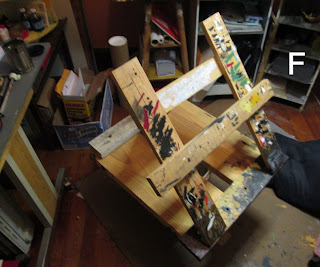
F) Carriage bolts inserted through the holes allow for the placement of a cross brace in case the lower part of the artwork has to be carefully articulated, or perhaps a small sign painted. This makes the work a lot easier on the spine, too.

Saturday, March 24, 2012

An Unfamiliar Medium

  
"Dunsmore Park,' Lithographer's Crayon, 5" x 8.5", '09
  In the post-mortem dispatching of personal effects, items that were of great value to the Departed may be overlooked, while conventional items may get cherished and coveted by family and friends. So for that reason, I have made a premature disbursement of this little drawing to my dentist and wife, who happens to be his assistant and bookkeeper.
  I drew this on site from my truck window with the complete certainty that I had just suffered either a heart attack or some major coronary event. It was Spring of ’09. I returned from a working trip to St. Louis, where I had spent an entire week immersed body and soul in an installation at the White Flag gallery there. The long hours and intense pace didn’t seem unusual to the crew I was working with—all men in their early thirties.  I got into the spirit of the event, which was part Dionysian, owing to the free-flowing spirits.
  When I awoke on my first morning back in Cincinnati, I couldn’t move. There was a relentless pain and pressure in my chest. As I weighed my options, I was fully conscious. If I lay perfectly still I would experience only a dull persistent central body ache that was semi-bearable. I eventually navigated from being fully prone to shuffling around bent at the waist, clutching my chest. I was in a game of Hamlet, veering between pretending nothing had happened to “something has to be done.” In all likelihood, the latter would include being cracked open like a walnut by interns, followed by the loss of our home. My wife was uncharacteristically panicked by my behavior, which included long stints of sitting on the kitchen floor with legs fully straight. It seemed to help when I pushed my back against the kitchen cabinets.
  I was eventually able to drive. Though funds were rapidly diminishing, I persisted in my Do Nothing regimen. I drove to my favorite local haunt, a little park near a Jewish Cemetery. On this beautiful afternoon I took out sketchbook and lithograph crayons, a medium that I had been dabbling with for years, but had never quite mastered. While it has its virtues: tonal subtleties, spontaneity, rich darks, simplicity (no messy tubes, jars or brushes)—erasing is not possible. As with watercolor, there is a narrow tolerance for screwing up.
  Through the pleasurable and intense work of looking at nature, even this tamed variety, I was able to deflect my worry about my condition. Of course, I was aware that life was precious beyond all the worth with which I had, up until that point, imbued it. I wanted to record my seeing in that heightened state of awareness. dove into the unfamiliar medium, only seeing and feeling. In that narrow window, I became adept with the lithograph crayon. Truthfully, I would enjoy doing this kind of work exclusively if I somehow had the means to sell it on a regular basis. But I am known as a graphic wise-guy and that is apparently my artistic destiny.
  As for the chest pain, with my last $100 I went to an acupuncturist. I told her that I was an old hippie. I wanted her to see if there was any way she could tell if there had been some coronary event, or if perhaps the pain came from another source. To my astonishment, she found that the source of the relentless chest pressure was a nerve trapped under the rib cage. The St. Louis session exacerbated a long-dormant condition that had been caused by an incident nearly three decades earlier. After defacing a billboard, I slipped and fell on the plank beneath, cracking some lower ribs. When I heard the news that all symptoms had a concrete physical cause unrelated to my heart, I began the process of consciously healing. I've never stopped since.
  This little drawing, deft and non-provocative, is a souvenir of one afternoon when I stared mortality down and found delightful life instead. It is now in the hands of people I greatly respect, who perform their daily artistry at an intensity few “fine” artists will ever know.  I hope it will provide some solace to their patients, lost in Novocain reveries.

Wednesday, February 15, 2012

Ex Libris Bookplates II

This is a continuation of the previous post. Sorry for the lapse--life got int the way.


Saturday, November 26, 2011

Ex Libris Bookplates I

L ike postage stamps and wine labels, modern Ex Libris bookplates combine words and images in unique ways that are both functional and aesthetically pleasing. All three are produced at predictable sizes--and until the Digital Age--printed by offset lithography. They exhibit engraving techniques and letterforms that were developed over centuries.
  Unlike their graven cousins, bookplates were made for individuals, not companies. There is no hierarchy of decision-makers to put a design through rigorous stages of approval. A bookplate is simply commissioned by somebody who values his or her personal library. Within this field, quirkiness and innovation are virtues because they celebrate the individual. The more successful examples make a poetic or universal statement while honoring the patron's ego.
  In several future posts I will have more to say on the subject. For now, feast your eyes on these random examples of the genre at its finest. They were a gift from my wife, the cartoonist Carol Tyler. She purchased an almanac of bookplates at a fundraising sale for the library at St. Mary Of The Woods College near Terre Haute, Indiana. Most of the plates date from the late 19th Century to the outbreak of WWI. They are from both American and European collections. All were glued onto heavy black paper, sometimes front and back, making razor blade triage necessary. I am now the temporary steward of this treasure trove and will store them in an archival setting. Come back in early '12 to see a new batch.